OCR Media Foundation Coursework
Wednesday, 15 May 2013
Tuesday, 14 May 2013
Monday, 13 May 2013
Sunday, 12 May 2013
Saturday, 11 May 2013
Friday, 10 May 2013
Evaluation Question 6
What have you learned about technologies from the process of constructing this product?
Tuesday, 7 May 2013
Evaluation Question 5
How did you address/attract your audience?
I collected information from a sample of a focus group to give me feedback on my magazine and to see what their initial thoughts were.
As you can see they understood what type of magazine it was and why some features were used, one person from the group pointed out the resemblance of Michael Buble which is perfect because that was the look I was going for. I was given some constructive criticism and I went and made the changes to my magazine to make it attract my audience and address them correctly.
Sunday, 5 May 2013
Evaluation Question 4
Who would be the target audience for your media product?
When I was creating my magazine I had to research into my target audience and a niche market for my product (genre). The target audience for my magazine are both male and females that range from the age of 16-30 and have an interest in pop music. The majority of my target audience would be in the social grade of C1, C2 and D (Lower-middle Class, Skilled Working Class and Working Class). I created Character Profiles whilst carrying out this research and here are the two Profiles that I came up with:
When I was creating my magazine I had to research into my target audience and a niche market for my product (genre). The target audience for my magazine are both male and females that range from the age of 16-30 and have an interest in pop music. The majority of my target audience would be in the social grade of C1, C2 and D (Lower-middle Class, Skilled Working Class and Working Class). I created Character Profiles whilst carrying out this research and here are the two Profiles that I came up with:
Saturday, 4 May 2013
Evaluation Question 3
What kind of media institution might distribute your media product and why?
A media institution is a company that distributes a certain product and I obviously need to focus on institutions that distribute magazines.
Main Media Institutions:
A media institution is a company that distributes a certain product and I obviously need to focus on institutions that distribute magazines.
Main Media Institutions:
- Bauer Media
- IPC Media
- Development hell ltd.
The two main institutions are Bauer Media and IPC Media. The magazine market is in a uncertain state partially due to the takeover of technology and online use. This means that institutions need to be careful when thinking about taking on a new magazine because they need to find the best magazine that will help the company financially. Print sales are being decreased and companies are distributing their product across multi-platforms such as online, Mobile phone, table etc.
I have come to the conclusion that IPC Media would be a better choice for my magazine because they are missing a Pop magazine and this would benefit them because they would be reaching out further and they could help my product make the switch over to digital whilst still keeping it in print because they're the UK's leading Digital distributers.
Friday, 3 May 2013
Evaluation Question 2
How does your media product represent particular social groups?
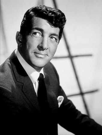


Here is the image that I used for my front cover in comparison to Michael Buble, obviously there are differences but I had to change things in my image to make it look more like a Music magazine whereas Michael Buble is known worldwide and most people would think that the magazine is going to be talking about a music when they see his face. However in this issue of my magazine it is showing young talented people that arent that famous yet.
I still do believe that these images do have similarities though, the clothing and angle of the shot. The lighting used for my image lacks the proffessional look so that is one thing that I would improve if I had the chance to, I may try to make it a bit lighter in photoshop for my final product.
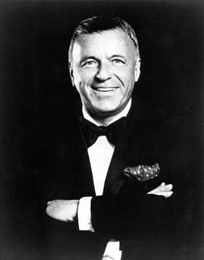
The image compared had a slight inspiration to my front cover but obviously I had to tweak it slightly I also had some other images from my style model (Q). I did show the model some examples of what I wanted him to look like then I asked him to pretend to sing (a feature I added to the image myself). I also researched hair styles of people that the artist found inspirational:


The hairstyle that I decided to use was Frank Sinartra's which was like a comb over also the artists main inspiration was Frank Sinartra so it makes it more suitable to use this one.
The social group that my magazine represents would be people who listen to pop music, do "mainstream" things and our from the ages of 16-30. I have chosen this age range because I dont think under 16's would be interested in a music magazine and I also believe that people over the age of 30 will lose interest in famous pop stars and what is going on in the music industry but that doesnt mean that there wont be people out of the age range chosen not buying this product.
Wednesday, 1 May 2013
Evaluation Question 1
In what way does your media product use, develop and challenge forms and conventions of real media products?
I looked at a variety of different layouts when I was researching existing magazines at an earlier date, the magazines that I looked into included "Q", "Kerrang", "NME" and "Mojo". The house styles of these magazines mainly chose three colours to use consistently throughout their magazine. Here you will see a comparison of the magazines that I looked at and my magazine:
 For the fonts and style I wanted to give it a Pop/Modern feel so that it would connote the genre of my magazine and I was trying to get my audience to recognize what type of magazine it was and what genre it was straight away. The content in my magazine is a mixture of formal and colloqiual language. I also made use of buzz words on my front cover as you can see "Exclusive" is put in the font Bebas and the colour of the word is changed to make it pop out at the audience. The fonts that I used in my magazine are: Bebas, Geo Sans and Neou.
I looked at a variety of different layouts when I was researching existing magazines at an earlier date, the magazines that I looked into included "Q", "Kerrang", "NME" and "Mojo". The house styles of these magazines mainly chose three colours to use consistently throughout their magazine. Here you will see a comparison of the magazines that I looked at and my magazine:
I chose to use orange, black and white (My background is a white/grey gradient) but these were chosen to establish a house style and identity for my Magazine so that consumers can recognize my magazine easily.
The genre that I wanted my magazine to be would be Pop but it also could be classed as a Jazz magazine because I featured an "artist" called "Lewis Wilde" who was "inspired by Frank Sinartra". The conventions that I considered when making my magazine were:
- Title of the Magazine
- Font and Style
- Costumes and Props
- Mise-en-Scene of Images
- People
- Content inside (Written)
- Genre and how its displayed
- Front Page Layout
- Contents Page Layout
- Double Page Spread Layout
The title I chose for my magazine was "Chord" and the reason for this is because it is a word that relates to music so it gives the audience a clue about this magazine when they havent purchased the product before. The definition of Chord is: 'A group of (typically three or more) notes sounded together, as a basis of harmony.' A unique feature in my title is that the first letter has a black background behind it (Keeping house style) which is used as the logo for the magazine, the idea was obviously influenced from the "Q" logo but I added a title to my logo to make it challenge the conventions of the other magazines. My title also includes a sub-title which is "Young talent in the North West" this also indicates another clue to the audience (that the magazine includes talented people from the North West). The font that I chose for my title was Bebas which I downloaded from dafont.com. I chose this font because it looks smart but it is also very bold allowing you to make that word stand out. I researched into what fonts other magazines use and almost all of them used San Serif but I wanted my magazine to be different.
When I thought about the use of Mise-en-Scene in my front cover image I had to research clothing, lighting and angle of the shot. I knew that I had to get the correct clothing to connote what genre my magazine was, I found that most of the clothing for a pop magazine was informal but my front cover artist had more of a jazz influence but he was still a pop artist but it was hard to make him connote the genre I wanted (pop) he supposed to be like Michael Buble so I found that he had to look smart and that is why he wore a suit (I was going to get him a hat but decided not to so he could display his hairstyle).
 For the fonts and style I wanted to give it a Pop/Modern feel so that it would connote the genre of my magazine and I was trying to get my audience to recognize what type of magazine it was and what genre it was straight away. The content in my magazine is a mixture of formal and colloqiual language. I also made use of buzz words on my front cover as you can see "Exclusive" is put in the font Bebas and the colour of the word is changed to make it pop out at the audience. The fonts that I used in my magazine are: Bebas, Geo Sans and Neou.
The genre I was trying to connote has been achieved in many ways, The Main ways being the model on the front cover, His clothes suggest that he is smart, well-off and modern and the fonts and language that was used.
Friday, 26 April 2013
Monday, 22 April 2013
Wednesday, 17 April 2013
Friday, 12 April 2013
Editing my Masthead.
After listening to the constructive criticism given from my focus group, I took it and changed my magazine. I changed my Masthead to be stretched across the top rather than centered.
Here are the before and after images(left being after):
Friday, 1 February 2013
Album Cover
I made an Album cover for an Artist that will be featured in my music magazine, this artist was called Lewis Wilde and the Album was named 'Achieve'.
Here is the final image used:
Here is the final image used:
Friday, 25 January 2013
Photoshoot Day
Today I had my Photoshoot which had been planned two weeks before,
It was successful and I achieved the photos that I wanted.
Here are some of the images without editing:
Friday, 11 January 2013
Plan for photoshoot
Today I planned for my photo shoot, Lewis Wilde will be one of my models.
- He will be using a suit as a costume.
- He will have a Microphone as a prop.
- The location will be the green screen which has been planned for Tuesday.
- Medium Close up
Here is an example of the look I am going for but without the cigar, I possibly could add the glasses and hat:
I have edited a photo to build the image I am hoping to achieve:
I might get two more models for the contents page, One with a guitar and another with a saxophone.
Monday, 7 January 2013
Thursday, 20 December 2012
Deciding my Magazines Price
Today I thought about the pricing of my magazine, I researched my style model to see what the price was for my type of magazine.
Here my style model is £3.00 so I made my magazine £2.49 to make it a better price and to challenge the conventions.
Here my style model is £3.00 so I made my magazine £2.49 to make it a better price and to challenge the conventions.
Friday, 14 December 2012
Finishing my Templates
Monday, 10 December 2012
Finding a suitable Colour scheme
I have been looking at colours to try and create a mixture of colours to make it fit with my genre (pop/jazz). I was looking for a smart, modern & simple colour scheme. I finalised my ideas with a Black, Orange and White (Gradient White-Grey).
Here is the outcome of this colour scheme:
I have already added a logo, masthead and subhead to give me a better Idea of what my magazine will look like with this magazine.
I also tried other colour scheme's to make sure that this was the colour scheme that is best.
Overall this is the best Colour scheme for my Audience I do believe, Im going to ask people for feedback on this colour scheme and See if it does fit to my audience. If they don't like it I'll find a better colour scheme for my final draft.
Thursday, 6 December 2012
Creating My character Profiles
I have pictured what my audience will be and made two character profiles (Male & Female):
Name: Tom Jones
Age: 22
Occupation: University Student
Income: £3,000
Disposable Income: £500
Hobbies: Learning, Socialising & Gaming.
Music: Micheal Buble, Adele, Ed Sheeran etc.
Films: Mission Impossible, Rush Hour, Days of thunder etc.
TV: X-Factor, Soccer AM, The Simpsons etc.
Name: Catherine Robertson
Age: 38
Occupation: Bank Assistant
Income: £40,000
Disposable income: £300 Monthly
Income: £40,000
Disposable income: £300 Monthly
Hobbies: Shopping, Dining & Socialising.
Music: Micheal Buble, Ed Sheeran, James Arthur etc.
Films: The Shawshank redemption, Harry Potter etc.
TV: X-Factor, Come Dine with me, Hells Kitchen etc.
Wednesday, 5 December 2012
Deciding my Magazine title.
I thought about my magazine title today and I wanted to relate it to music.
Here are the draft titles:
- Bass
- Chord
- Tune
- Loud
- Play
I decided to go with Chord, all of my drafts were short and catchy but I believe that Chord is more suitable for a music magazine because it still relates to music but has a more classy sound to it.
Tuesday, 27 November 2012
Finalising Music Magazine Font
Today I looked at fonts on a website called dafont.com and picked the following, Bebas, Gill Sans MT and Neou.
Friday, 23 November 2012
Planning for my Front Cover Photograph
I have been planning for my Front Cover Photograph; I took into consideration the Location, When it was going to take place, Who was going to be there, Camera Angle, Costume (Clothes), Resources needed and props. Here is the plan I that i created:
- Artist - Lewis Wilde
- Date & Time - Saturday 1st December at 1.00pm
- Location - Archway looking at Liver birds & Echo Arena & school hall
- Costumes - Suit
- Props - Sunglasses, Microphone, Piano
- Resources needed - Camera
- Camera Angle - Medium Close Up (Could be further back though)
I have also took a draft shot of my front cover photograph (I also edited it to give a better example):
Thursday, 15 November 2012
Removing Backgrounds In photoshop
Today I removed a Photographs background using a Photo-Editing Software (Photoshop).
Here is evidence of me removing the background of the photograph:
I used the following tools; magic wand, rubber and blur to get to this stage with the photograph.
Monday, 12 November 2012
Locations
 Today I have been looking at Locations in Liverpool on Google because I am going there soon to try and focus on a location in liverpool and maybe use it to the best advantage (Culture or to represent where the magazine has been set).
Here are some of the Images I found:
If I use a location from Liverpool i will probably be using the Echo Arena or A location were the Liver birds are in sight. The Liver birds would be used to show where the magazine is set whereas the Echo arena could be used just to show that it is a music magazine.
Friday, 2 November 2012
Image for Pre-Liminary Contents Page
Deciding which Image to use for my Contents Page (Pre-Liminary)
I have been thinking about how I am going to be laying out my contents page and I have decided to but an Image in the background.
Here are some Images that I have been looking at:
Saturday, 27 October 2012
Further Research
Today I researched further into institutions and looked at the online magazine monkey in more detail to make sure I had enough information for my assessment next month. I found that monkey was only distributed online. This magazine is also available via mobile phone online also so it can reach their audience wherever they are. Monkey is aimed at 16 to 30-year-old males. Monkey is published weekly and is free and earns its money through advertising.
I also researched publishing magazines online and found I company that I believe to be free,
Here are the features that the company provide:
Wednesday, 24 October 2012
Finalising my Style Model
Finalising my Style Model
The style model that i finalised was Q it is a great magazine that reaches out to a good audience so it uses everything well. I will be trying to keep up to Q's standards to try to make my magazine professional. I have been looking at some issues published by Q to notice what type of magazine i need to be making. Here are some of the issues that i looked at:

Q thought that the older generation were being ignored in the music industry so they decided that there target audience was both genders over the age of 25. My target audience may be different and targeted to younger people but its still a good style model.
Subscribe to:
Comments (Atom)


